Tuesday, 7 May 2013

Competition Brochure

This week I've had the chance to put my editorial skills into practice! At work I've been asked to create a 'Competition Brochure' as part of Apprenticeship week which takes part in June.

I wanted to create something that looked really modern and fresh, to reflect the fast paced and contemporary hairdressing industry; to which the brochure is targeted.

I had a play around with colours to see which one would look most effective:


I opted for the peach colour. I felt the blue looked too cold (a good look for the winter months!) and the green did not stand out enough.

Friday, 3 May 2013

Using Brusho - Illustration Development

As part of my illustration module I have been looking into different skills and techniques that I could apply to my final design. My live brief is to create a children's book cover for The Wind In The Willows as part of the Penguin Design Competition.

After experimenting briefly with brusho (a dry powder that mixes with water to produce a paint medium) techniques, I decided to create a green texture that could be used as a background for my final book cover - to represent the woodlands of The Wind In The Willows.

This is how it looks and the aftermath!:


I think my next step will be to cut out a variety of leaf shapes and scan them onto the computer to have a play around.I think the authenticity of the brusho texture will look really nice as part of my final design. 

Tuesday, 30 April 2013

Newcastle Fashion Week

I'm not a very fashionable person, but I've been really excited for Newcastle Fashion Week! I'm a massive people watcher and love seeing everyone's quirky and eccentric styles! When there's local events like this, there's a distinctive buzz in the air and I'm hoping to gain a lot of inspiration from the week.


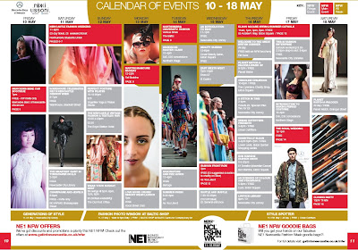
The NFW official magazine is out now and it's a really nice editorial piece. Its busy and bold but in a non-overpowering way, everything perfectly placed. I think this would have been a really fun project to work on, supporting the local area.

My favourite spread from the magazine is the 'events calendar':


I really like the overall layout and the geometric shapes; there's so much to look at.

The full magazine can be seen here:

http://www.getintonewcastle.co.uk/wp-content/uploads/2013/03/NE1-NFW13-Brochure-Web.pdf

Wednesday, 24 April 2013

Illustration Types

As part of my latest module, I have been asked to research different types of illustration. When I first received this module, I was worried because my drawing skills are far from perfect! But after completing my research tasks, I've learnt that illustration isn't just about drawing (phew!). The 5 types of illustration I chose to look into were: collage, watercolour, graffiti, pen and ink and cartoon. Here are some of my favourites:

Collage Illustration


Watercolour Illustration


Graffiti Illustration


Pen & Ink Illustration
 
 
Cartoon Illustration


Sunday, 14 April 2013

Work Based Learning - Final Design

This is my final design for Alfred Hitchcock's Rear Window:
 
I wanted to create a poster that appealed to the cinema's current flow of customers - the avid film fanatics - as well as target a brand new younger audience. The vintage feel of the image and background was targeted at the cinemas current audience, as film fanatics, I wanted them to be able to recognise that this was a recreation of a classic Hitchcock. The bold title and 'rip' effect was aimed at the new generation of customers, as a sort of modern twist on an old classic.

Friday, 29 March 2013

Tyneside Cinema Visit

This week FdA Graphics visited our Work Based Learning module client; Tyneside Cinema. We were given a short presentation by Ruth Hastings, Young Tyneside's Projects Officer, on the 'design management process'. Ruth gave us a brief history of the cinema and an outline of their audience, which really helped me to get a more in-depth idea of my client and the audience that my final design would be targeting. Ruth also gave us a thorough insight into working alongside a live client and told us to: always listen to the needs of the client, be clear on the small details, be prepared to make changes and most importantly, be creative!

On the back of the visit to the cinema, we were asked to brainstorm the 'design cycle' and my group produced this basic progression of the designer to client relationship:
 
 
Client → Brief & Budget → Designer → 1st proof → Circulation → Designer → Changes → Final proof → Circulation → Print


Friday, 22 March 2013

Art Directing a Photoshoot

Today was the day of the photoshoot as part of my Work Based Learning Module! Me and Steven (who is also doing Hitchcock's Rear Window) got into the studio at around 2pm to start shooting.

At first I felt a little shy but soon got into the swing of things. I presented my mood boards to the models so that they had a clearer understanding of what I wanted from them and they didn't take much directing! Stacey, my photographer, knew exactly what she was doing and altogether I felt we worked well as a team. Throughout the day we were able to have a look around the studio and it was really good to see how everyone else was getting on and what ideas they had. Overall it was a really good day and a brand new experience. Here's some 'behind the scenes' pictures from the shoot: